

User needs at the frontlines
Operators in remote sites require displays that remain legible under bright sun, quick to boot, and rugged enough for transport. A user-centric approach begins by listing those exact needs: readable in direct daylight, resistant to dust and water, and predictable under thermal stress. Practical solutions pair hardware choices with software adaptations; an embedded solution that understands both display physics and enclosure design shortens the development cycle. Many teams—military liaison groups and civil search‑and‑rescue units included—expect compliance with MIL‑STD‑810 for shock, vibration, and temperature ranges, so design decisions must respect those constraints while keeping the interface usable on the ground.
Brightness, contrast and what “sunlight readable” really means
Daylight readability is not a single number but a set of interacting properties. Brightness (high‑nit outputs like 1000–2000 nits) is necessary but not sufficient. Contrast ratio, anti‑reflective coatings, and gamma correction determine usable contrast when sun glare is present. Hardware choices—high‑nit panels and low‑reflectance coatings—work best when paired with software tactics such as adaptive gamma and forced high‑contrast skins. This combination reduces touch errors and speeds decision time under glare without increasing battery drain unnecessarily.
Thermal, power, and enclosure constraints
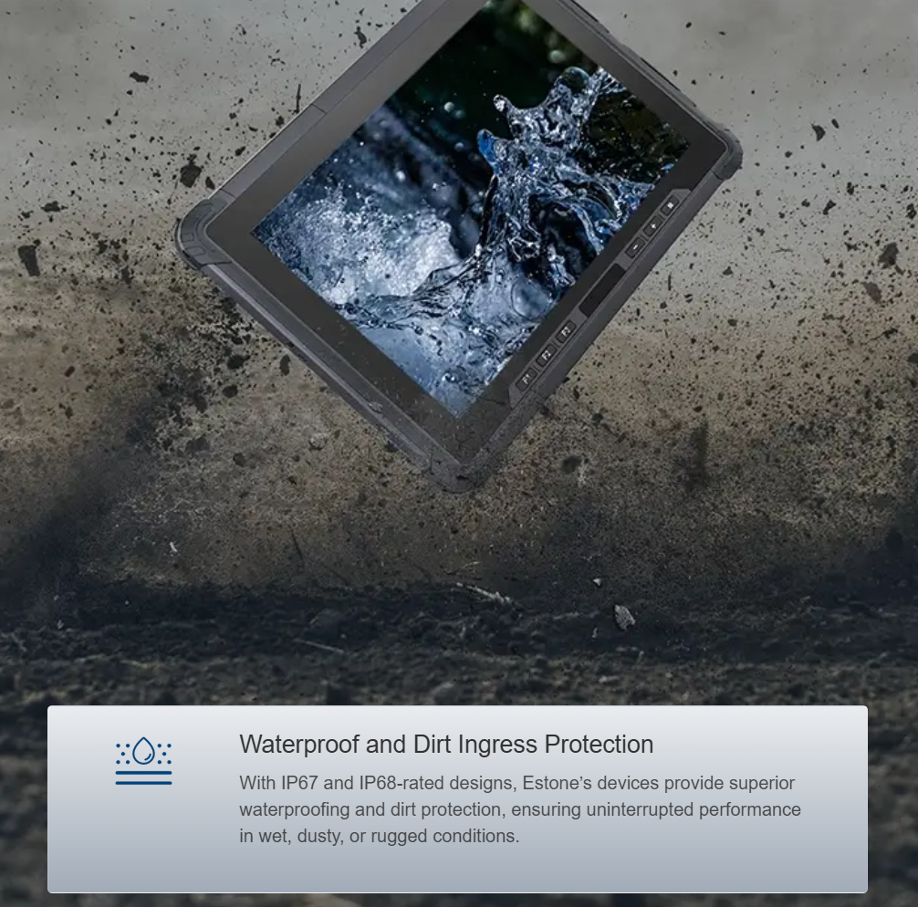
Increasing display brightness raises heat inside a compact chassis. Designers must trade off peak luminance against continuous operation and thermal throttling. Heavy‑duty portables often adopt passive heat paths, metal frames, and strategically placed vents to meet MIL‑STD heat cycles. IP67 seals are common for ingress protection, but sealing must not trap heat—engineers balance gasket placement and thermal conduits accordingly. The result is a device that holds 1,000 nits for sustained periods without aggressive fan noise that interferes with communications.
Front‑end considerations: readable UI in harsh light
Front‑end engineers must plan for CSS media queries tied to ambient light, scalable iconography, and reduced color reliance. Use large touch targets, bold iconography, and adaptive fonts to maintain legibility at distance. Implement ambient‑light hooks and toggle a “high‑contrast” stylesheet automatically. Touch latency and palm rejection matter more outdoors because users often wear gloves or operate while moving; calibrate touch drivers and test with gloved users early. These actions keep the UI predictable and fast for operators who cannot wait for a reboot.
Integration choices and the role of the tablet pc manufacturer
Choosing components from a proven tablet pc manufacturer reduces integration risk. A manufacturer familiar with rugged displays and MIL‑STD testing speeds certification and removes guesswork about thermal envelopes and EMI behavior. Look for partners who publish thermal curves, brightness vs. power charts, and touchscreen latency figures. Such transparency shortens validation and helps product managers set realistic operational expectations.
Common mistakes and alternative strategies
Teams often fixate on peak nits while ignoring glare and contrast—this is costly. Over‑sealing for IP ratings without thermal pathways creates throttling. On the software side, relying solely on color shifts rather than layout and typography changes reduces clarity. Alternatives include transflective displays for mixed light environments, localized backlight zones to reduce power draw, and hardware anti‑glare films that combine with adaptive UI themes. Field testing is non‑negotiable—lab numbers do not always predict user success on a dusty airfield or a sunlit rooftop.
Three golden rules for selection
1) Prioritize sustained daylight performance over peak brightness. Measure sustained nits at operating temperature, not cold‑start numbers.
2) Demand documented environmental compliance (e.g., MIL‑STD‑810) and thermal charts from suppliers; verify in real conditions.
3) Insist on adaptive UI patterns: large touch targets, ambient‑light driven themes, and fallback high‑contrast modes to ensure readable interaction under all conditions.
Final assessment and practical outcome
When engineering teams apply user‑centric constraints—brightness balanced with thermal design, UI tuned for high contrast, and a trusted hardware partner—the result is predictable equipment that improves mission speed and reduces field failures. Real‑world anchors like MIL‑STD testing and typical 1000–2000 nit targets make tradeoffs measurable. Choose partners who provide data, not promises. Estone. —